The Nuremberg Nexus
In the opening decades of the sixteenth century, the Free Imperial City of Nuremberg was a crucible. It was a city of merchants and makers, where the flow of capital and goods was matched by an electric exchange of ideas. Here, the rigid hierarchies of the medieval world were giving way to a new kind of society, one built on skill, intellect, and ambition. At the very center of this ferment were two men, a friendship so close and intellectually symbiotic that it would come to define the spirit of the age: the artist Albrecht Dürer and the patrician-humanist Willibald Pirckheimer.
Dürer, the son of a goldsmith, was a master of observation, his eye and hand capable of rendering the world with unprecedented precision and psychological depth. Pirckheimer, born to one of the city’s leading families, possessed a formidable intellect, a command of Greek and Latin, and a passion for resurrecting the lost wisdom of the classical world. Their bond was forged not just in the taverns and council chambers of Nuremberg, but in a shared vision. They both understood that they were living through a moment of profound transformation, and that the new technology of printing offered an unparalleled tool to shape it.
Their collaboration was not merely social; it was a professional and intellectual partnership. Dürer engraved a formidable portrait of his friend; Pirckheimer composed Latin inscriptions for Dürer’s triumphal arches. They were the twin pillars of a vibrant humanist network, men who believed that art and scholarship were not separate pursuits, but two sides of the same coin—the noble endeavor of understanding and beautifying the world. It was this shared conviction that would give rise to an object that became a landmark in the history of the book: a simple title page that was, in fact, a revolution in paper and ink.
A New Frame for Ancient Ideas
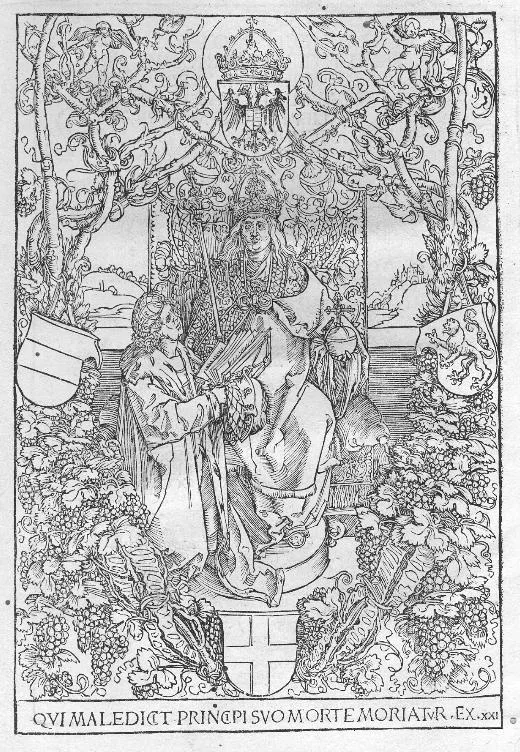
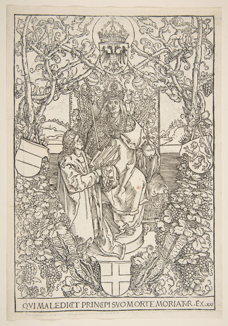
In 1515, a book issued from the Nuremberg press of Friedrich Peypus. It was Pirckheimer’s Latin translation of the second-century Greek satirist Lucian of Samosata’s De ratione conscribendae historiae (On the Writing of History). For the humanist circle, the publication was a significant event, another piece of the classical past reclaimed for the modern world. But its true innovation lay on its very first page. Here, the reader was met not with a simple block of text, but with a magnificent architectural frame, a woodcut border of breathtaking complexity and elegance, designed by Dürer.
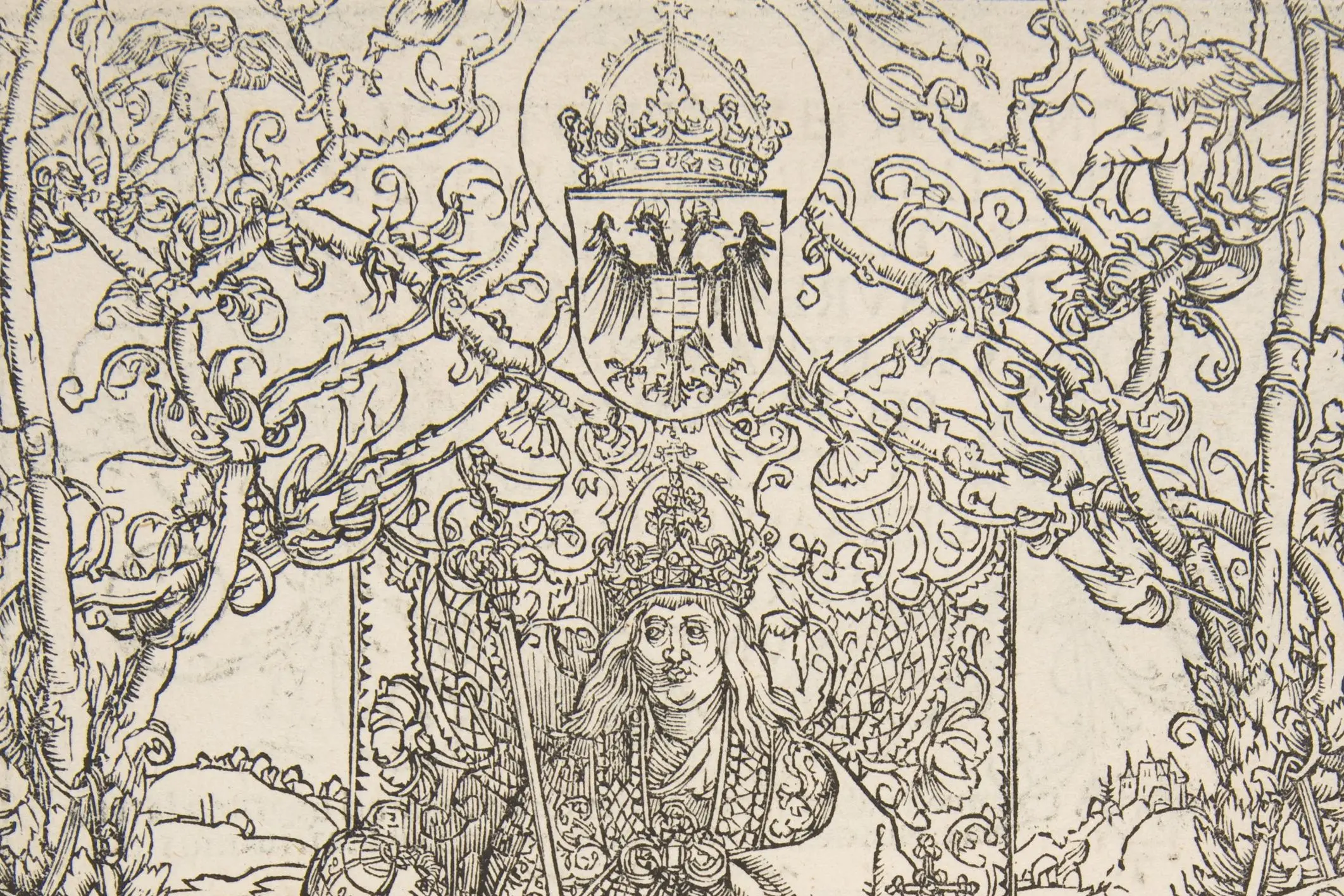
This was no mere decoration. It was a statement of intent, a visual manifesto for the entire humanist project. Dürer created an all’antica gateway, a triumphal arch through which the reader would enter the world of the classical text. Fluted columns rise, supporting a pediment adorned with garlands and masks. At the base, putti—cherubic figures drawn directly from the visual vocabulary of the Italian Renaissance—playfully support a shield, ready for the owner’s coat of arms. The design is a symphony of classical motifs, rendered with Dürer’s characteristic Northern precision.
What Dürer and Pirckheimer created was a complete aesthetic package. The classical clarity of Lucian’s text, translated into the scholarly Latin of Pirckheimer, was now clothed in a visual language that mirrored its intellectual origins. The page announced that this was not a medieval book, but something new: a Renaissance object, a vessel for ancient wisdom presented with modern artistry. The border was first used for one of Pirckheimer's publications in 1513 and would ultimately grace five of his works, becoming a signature of their shared cultural program. It elevated the printed book from a utilitarian object for transmitting text into a curated aesthetic experience, a work of art in its own right.
The Woodcut as Engine of an Ideal
The choice of medium was as significant as the design. Dürer was the undisputed master of the woodcut. In his hands, this once-crude technique for printing simple images was transformed into a medium of astonishing subtlety and power. He had already demonstrated its narrative force in his monumental Apocalypse series and its devotional intensity in the Small Passion. He understood, with the intuition of both an artist and a shrewd businessman, the unique power of the print: infinite reproducibility.
Unlike a painting or a drawing, a woodcut block could be used again and again, producing hundreds, even thousands, of near-identical impressions. Each one carried the artist's original vision, the precise cut of his line, unaltered. The block for Pirckheimer's title page became a tool for dissemination, a stamp of quality and intellectual seriousness that could be applied to multiple works. Every copy of Pirckheimer’s translations that left the press carried with it a piece of Dürer’s genius, spreading their shared humanist aesthetic across Germany and beyond.
This act of mechanical reproduction was central to the humanist mission. It was a democratization of knowledge and beauty. A wealthy prince could commission an illuminated manuscript, but the printed book, adorned with a Dürer woodcut, could reach a far wider audience of scholars, students, and educated merchants. Dürer’s press, which he used to self-publish his great theoretical treatises, was not just a workshop; it was an engine for the propagation of an ideal. The title page was proof that the highest artistic standards could be married to the new mass medium, setting a precedent that would influence generations of printers and illustrators across Europe.
A Legacy in Ink and Paper
The impact was immediate and lasting. The Dürer-Pirckheimer model—the scholar’s text presented within the artist’s frame—became the gold standard for high-end scholarly publishing. The design was copied and adapted by artists in Italy and Germany, becoming part of the fundamental grammar of book design. The original woodblock itself had a long and productive life. Its continued use is a testament to its success; so much so that impressions from later editions, such as a 1612 Italian printing, show the inevitable signs of wear. The crisp, black, sculptural lines of the early pulls give way to the grayer, slightly thicker impressions of a block worn down by the repeated pressure of the press. This physical degradation is itself a record of the design's immense popularity and influence.
The journey of any single copy tells a story of this enduring legacy. An early impression, perhaps acquired in Nuremberg in 1515, might eventually find its way into the library of a great nineteenth-century collector like Dr. George Kloss of Frankfurt. His bookplate and neat manuscript label, “no. 2343,” transform the Renaissance object into a documented piece of bibliophilic history, a testament to its long-held value.
Looking at the page today, we see more than just a brilliant piece of graphic design. We see the physical embodiment of a friendship and a shared intellectual world. It is a monument to a particular time and place—Renaissance Nuremberg—but its message is timeless. It speaks to the power of collaboration, to the idea that the deepest cultural innovations happen when the hand of the artist and the mind of the scholar work in perfect concert. It is a testament to the moment when the book became fully modern, a carrier not just of words, but of a complete and deliberate world view, perfectly framed.
Seen at auction: Sotheby's